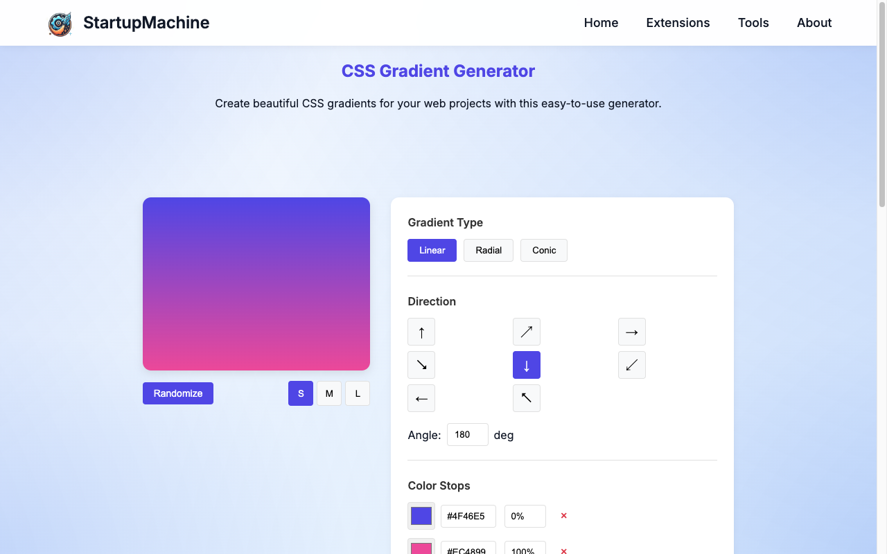
StartupMachine's CSS Gradient Generator tool interface
CSS gradients have revolutionized web design by allowing developers to create smooth color transitions without using images. They're versatile, resolution-independent, and load faster than image-based backgrounds—making them ideal for creating beautiful, modern web designs.
However, writing gradient CSS code from scratch can be challenging, especially when trying to create complex color combinations or specific patterns. This is where our CSS Gradient Generator tool comes in, offering an intuitive visual interface to design gradients and generate the corresponding CSS code.
In this comprehensive guide, we'll explore how to use CSS gradients effectively, understand the different types of gradients available, and walk through practical examples using our generator tool.
Key Takeaways
- Understand the three main types of CSS gradients: linear, radial, and conic
- Learn how to create visually appealing color transitions using our CSS Gradient Generator
- Master the process of customizing gradient direction, color stops, and other properties
- Discover practical use cases and implementation techniques for gradients
- Explore advanced gradient patterns and techniques for modern web design
Understanding Gradient Types
Before diving into the tool, let's understand the three main types of CSS gradients:
Linear Gradients
Linear gradients transition colors along a straight line. You can control the direction by specifying an angle or using keywords like "to right" or "to bottom left".
background: linear-gradient(to right, #3494E6, #EC6EAD);Radial Gradients
Radial gradients transition colors outward from a central point, creating circular or elliptical patterns. You can specify the shape, size, and position of the gradient.
background: radial-gradient(circle, #3494E6, #EC6EAD);Conic Gradients
Conic gradients rotate colors around a center point (like a color wheel). They're excellent for creating pie charts, color wheels, and other circular designs.
background: conic-gradient(from 0deg, #3494E6, #EC6EAD, #3494E6);Did You Know?
CSS gradients were first introduced in 2011 with CSS3 and have since become one of the most widely used CSS features for creating engaging visual effects without images.
Using the CSS Gradient Generator
Accessing the Tool
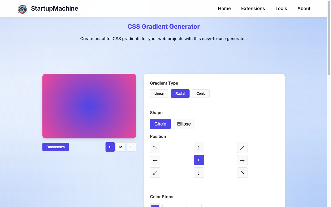
Let's start by accessing our CSS Gradient Generator tool. The interface is user-friendly and allows you to create and customize gradients without writing any code.
The CSS Gradient Generator tool's main interface
Creating Linear Gradients
To create a linear gradient using our tool:
- Select "Linear" from the gradient type dropdown
- Use the angle slider or input field to set the direction (0-360 degrees)
- Add color stops by clicking on the gradient preview bar
- Adjust the position of each color stop by dragging or using the percentage inputs
- Modify colors by clicking on the color boxes and using the color picker
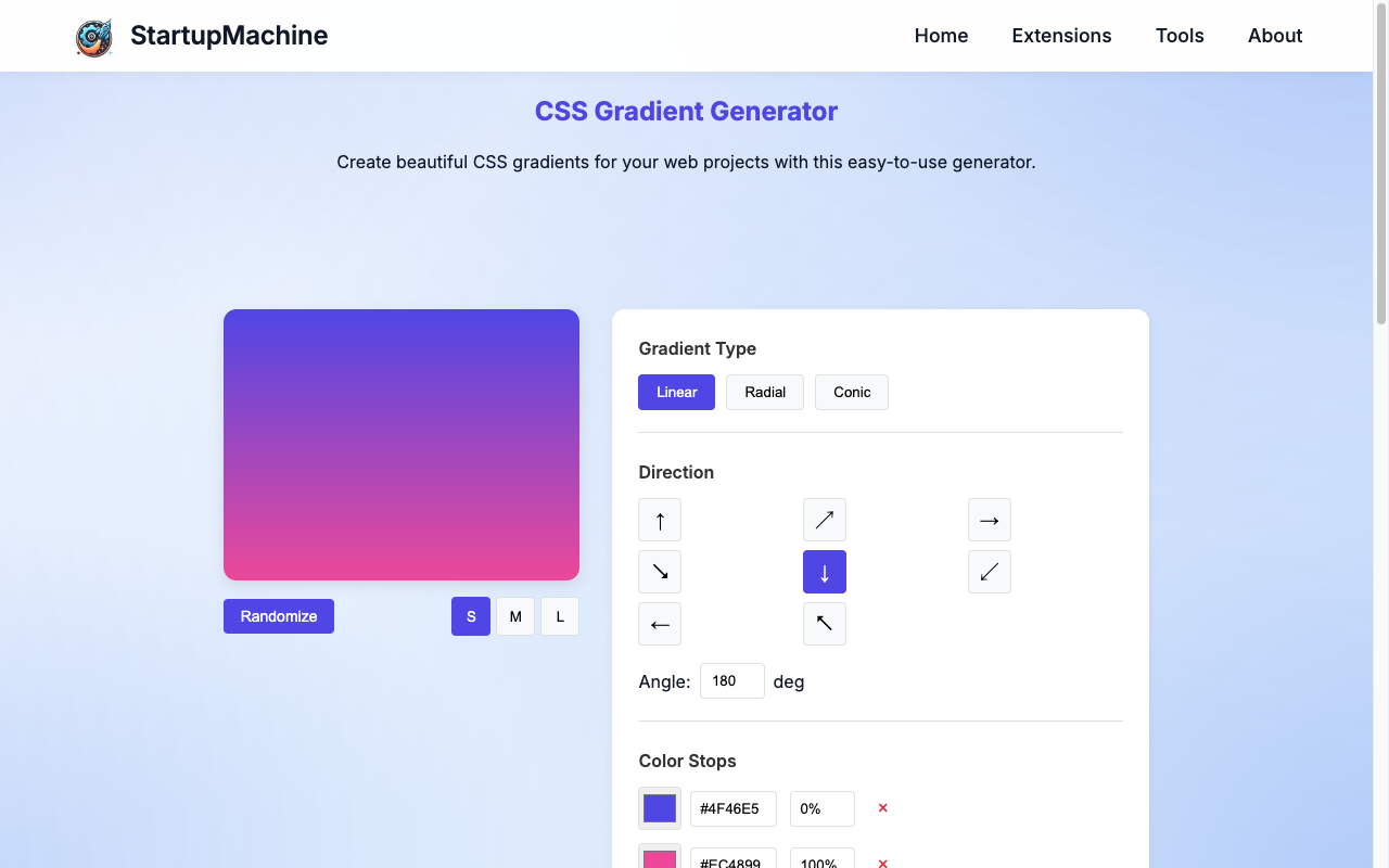
Adjusting parameters for a linear gradient
Pro Tip
For smoother transitions between colors, add intermediate color stops. For instance, if transitioning from blue to red, adding a purple stop in between can create a more natural blend.
Creating Radial Gradients
For radial gradients:
- Select "Radial" from the gradient type dropdown
- Choose between "Circle" or "Ellipse" for the shape
- Adjust the position using the X and Y position controls
- Add and adjust color stops as with linear gradients
- Optionally, modify the size using the size presets (closest-side, farthest-corner, etc.)
Creating a radial gradient with the tool
Creating Conic Gradients
For conic gradients:
- Select "Conic" from the gradient type dropdown
- Adjust the starting angle using the angle control
- Set the center position using X and Y position controls
- Add and adjust color stops around the circle
Browser Support Note
Conic gradients have more limited browser support than linear and radial gradients. Always test your design in different browsers or provide fallbacks for older browsers.
Copying and Using the Code
Once you're satisfied with your gradient:
- Click the "Copy CSS" button to copy the generated code to your clipboard
- Paste the code into your CSS file or style tag
- Apply the gradient to your desired element
Example Implementation
/* In your CSS file */
.gradient-background {
    background: linear-gradient(45deg, #3494E6, #EC6EAD);
    /* Other properties */
    width: 100%;
    height: 300px;
    display: flex;
    justify-content: center;
    align-items: center;
    color: white;
}
HTML Implementation
<div class="gradient-background">
    <h2>Beautiful Gradient Background</h2>
</div>
Practical Use Cases
Hero Sections
Gradients make for striking hero section backgrounds, creating visual interest without distracting from content.
.hero {
    background: linear-gradient(135deg, #667eea, #764ba2);
    height: 80vh;
    display: flex;
    align-items: center;
    justify-content: center;
}
Button Styling
Gradient buttons can create a sense of dimension and interactivity.
.gradient-button {
    background: linear-gradient(to right, #4776E6, #8E54E9);
    border: none;
    color: white;
    padding: 12px 24px;
    border-radius: 4px;
    transition: 0.3s;
}

.gradient-button:hover {
    background: linear-gradient(to right, #4776E6, #8E54E9);
    transform: translateY(-2px);
    box-shadow: 0 8px 15px rgba(0,0,0,0.1);
}
Card Backgrounds
Subtle gradients can add depth to card elements without overwhelming their content.
.gradient-card {
    background: linear-gradient(to bottom right, #ffffff, #f0f0f0);
    border-radius: 8px;
    padding: 24px;
    box-shadow: 0 4px 12px rgba(0,0,0,0.08);
}
Section Dividers
Gradients can create interesting section dividers using the CSS clip-path property.
.section-divider {
    height: 100px;
    background: linear-gradient(45deg, #FF9A8B, #FF6A88, #FF99AC);
    clip-path: polygon(0 0, 100% 0, 100% 65%, 0% 100%);
    margin-top: -50px;
}
Advanced Gradient Techniques
Multiple Gradients
You can layer multiple gradients for complex effects using the CSS background property's ability to accept multiple values.
.layered-gradient {
    background:
        linear-gradient(45deg, rgba(255,0,0,0.3), transparent),
        radial-gradient(circle at top right, rgba(0,255,255,0.3), transparent),
        linear-gradient(to bottom, #ffffff, #f0f0f0);
}
Gradient Text
Create eye-catching text with gradient fills using background-clip.
.gradient-text {
    background: linear-gradient(45deg, #f3ec78, #af4261);
    -webkit-background-clip: text;
    background-clip: text;
    color: transparent;
    font-weight: bold;
    font-size: 3rem;
}
Repeating Gradients
Create striped or patterned backgrounds using repeating gradients.
.striped-background {
    background: repeating-linear-gradient(
        45deg,
        #f6f8fa,
        #f6f8fa 10px,
        #ebedf0 10px,
        #ebedf0 20px
    );
}
Browser Compatibility
When using CSS gradients, it's important to be aware of browser compatibility:
| Gradient Type | Chrome | Firefox | Safari | Edge | IE |
|---|---|---|---|---|---|
| Linear Gradient | 26+ | 16+ | 6.1+ | 12+ | 10+ |
| Radial Gradient | 26+ | 16+ | 6.1+ | 12+ | 10+ |
| Conic Gradient | 69+ | 83+ | 12.1+ | 79+ | No |
Cross-Browser Support
For maximum compatibility, our CSS Gradient Generator automatically includes vendor prefixes where needed. For conic gradients, consider providing a linear or radial gradient fallback for older browsers.
Performance Considerations
While gradients are more performance-friendly than images, there are still some considerations to keep in mind:
- Complexity - Complex or multiple layered gradients can impact rendering performance
- Animation - Animating gradients can be CPU-intensive; use sparingly and test on lower-end devices
- Mobile Considerations - Keep gradients simpler on mobile to maintain performance
- Repaints - Changing gradient properties can cause full element repaints
Performance Warning
Avoid animating gradients on elements that take up large portions of the screen, as this can cause significant performance issues, especially on mobile devices.
Conclusion
CSS gradients provide a versatile and efficient way to add color and depth to your web designs without relying on images. Our CSS Gradient Generator tool makes it easy to create beautiful, customized gradients for any project without writing complex CSS code.
Whether you're designing buttons, backgrounds, or complex UI elements, gradients can help elevate your design while maintaining good performance. By understanding the different types of gradients, their properties, and practical applications, you can create engaging visual experiences for your users.
Remember to consider browser compatibility and performance implications, particularly when using newer gradient types or complex gradient patterns.
Ready to Create Your Own Gradients?
Try our CSS Gradient Generator now to design beautiful gradients for your next web project.
Try CSS Gradient Generator