StartupMachine's Color Palette Generator tool in action
Have you ever stumbled upon a photo with the most stunning color combination and wished you could use those exact colors in your design project? Good news: you absolutely can! Extracting color palettes from images is not only possible but also a powerful design technique used by professionals to create cohesive and emotionally resonant visuals.
In this comprehensive guide, I'll walk you through the entire process of extracting beautiful, usable color palettes from any photograph, and show you how to effectively apply these colors to your design projects. Whether you're a web designer, graphic artist, or digital marketing professional, this technique will elevate your color selection process and help you create more visually harmonious work.
Key Takeaways
- Learn why photos make excellent sources for professional color palettes
- Discover both automatic and manual techniques for color extraction
- Understand how to apply extracted colors effectively in your designs
- Master the principles of color harmony to refine your palettes
Why Extract Colors from Images?
Finding the perfect color palette can be one of the most challenging aspects of design. While you could spend hours manually experimenting with color combinations, photographs provide nature's own perfectly harmonized color schemes. Here's why extracting colors from images is such a powerful approach:
Natural Harmony
Colors in photographs—especially in nature—naturally work well together because they exist harmoniously in the real world.
Emotional Connection
Using colors from meaningful images allows you to transfer the emotional impact of the photo to your design.
Unique Combinations
Discover unexpected color combinations you might never consider when creating palettes from scratch.
Brand Authenticity
For brands with strong visual identities, extracting colors from on-brand photography ensures consistency.
Choosing the Right Image
Not all images will yield equally useful color palettes. The best source images typically have:
- Clear color variations - Images with a good range of both light and dark tones
- Complementary colors - Look for naturally occurring color schemes with good contrast
- Relevance to your project - Images that relate to your brand, product, or content
- The right mood - Colors evoke emotions, so choose images that match your desired feeling
Tutorial: Extracting a Color Palette
Now that you understand why image-based color extraction is valuable, let's dive into the actual extraction process using StartupMachine's Color Palette Generator tool.
Before extracting colors, ensure your image is high quality and properly exposed. For best results:
- Choose images with clear, distinct colors
- Avoid heavily filtered or artificially enhanced photos
- Consider cropping to focus on the most relevant color areas
If you're using the image for branding purposes, select something that aligns with your brand values and identity.
Visit the StartupMachine Color Palette Generator to begin the extraction process:
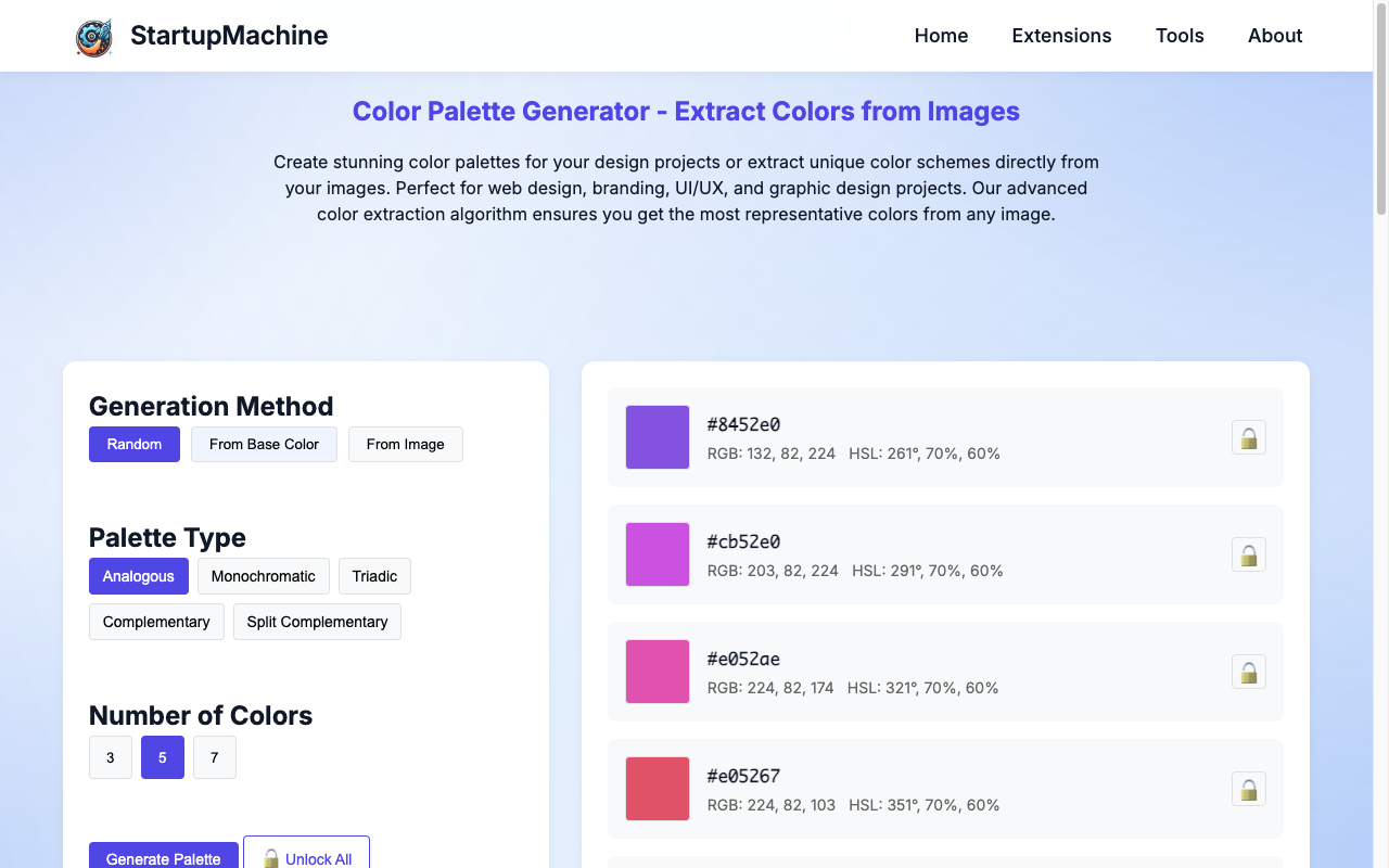
The initial interface of our Color Palette Generator tool
- Click on the "Upload Image" button or drag and drop your photo into the designated area
- Wait for the image to upload and process
- The tool will automatically extract a balanced color palette from your image
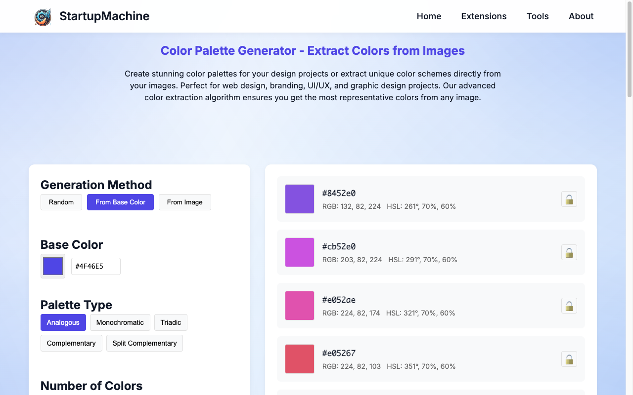
Setting a base color to create a harmonious palette
Alternatively, you can set a base color by clicking on different areas of your image or entering a specific hex code. This allows you to build a palette around a particular color that you want to highlight.
Once you have an initial palette, you can further refine it:
- Choose different palette types such as analogous, monochromatic, or complementary
- Adjust the brightness and saturation of individual colors
- Lock colors you want to keep while regenerating others
- Manually replace specific colors that don't work for your needs
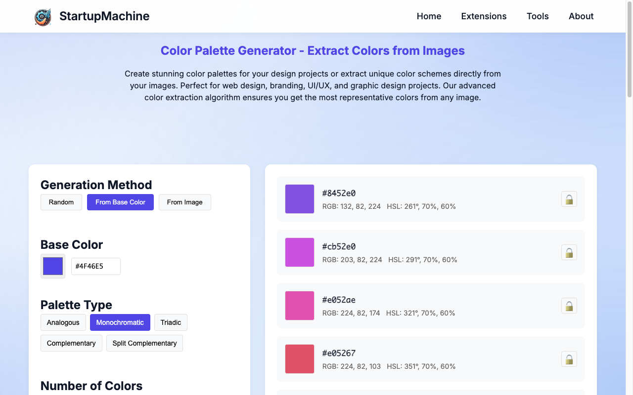
Generating a monochromatic color scheme based on the selected color
For professional design work, aim for a palette with:
- 1-2 primary colors (for main elements and branding)
- 2-3 secondary colors (for accents and supporting elements)
- 1-2 neutral colors (for text, backgrounds, and balance)
Pro Tip: Make sure your palette includes sufficient contrast for accessibility. At minimum, you need colors that will provide good text-to-background contrast ratios (at least 4.5:1 for standard text).
Applying Extracted Colors
Now that you have your perfect palette, here's how to apply it effectively across different design contexts:
Website Design
When implementing your palette in web design:
- Primary color: Use for main action buttons, key headings, and branded elements
- Secondary colors: Apply to secondary buttons, icons, and supporting elements
- Neutral colors: Ideal for text, backgrounds, and subtle UI elements
- Accent colors: Use sparingly for highlighting important information or creating visual interest
Implementing Your Palette in CSS
:root {
  /* Main palette from extracted colors */
  --primary: #3366ff;
  --primary-light: #6699ff;
  --primary-dark: #0044cc;
  --secondary: #ff6b6b;
  --accent: #ffd166;
  --neutral-light: #f8f9fa;
  --neutral-dark: #343a40;

  /* Derived semantic colors */
  --text-primary: var(--neutral-dark);
  --text-secondary: #495057;
  --background: var(--neutral-light);
  --button-primary: var(--primary);
  --button-hover: var(--primary-dark);
  --link: var(--primary);
  --link-hover: var(--primary-dark);
}

/* Usage examples */
body {
  background-color: var(--background);
  color: var(--text-primary);
}

.button {
  background-color: var(--button-primary);
  color: white;
}

.button:hover {
  background-color: var(--button-hover);
}
Branding Materials
For consistent branding across all materials:
- Create a brand style guide that documents your palette with hex codes, RGB, and CMYK values
- Designate specific colors for different brand elements (logo, tagline, supporting graphics)
- Define color usage rules to maintain consistency
- Include examples of correct and incorrect color applications
Social Media Content
For social media assets:
- Use your brand colors consistently across all profiles and posts
- Create templates with your color palette pre-defined
- Develop distinctive color combinations for different content categories
- Maintain visual cohesion while allowing flexibility for different platforms
Color Harmony Principles
Understanding color theory will help you refine extracted palettes. Here are key harmony principles:
Complementary
Colors opposite each other on the color wheel, creating high contrast and visual vibrance.
Analogous
Colors adjacent to each other on the color wheel, creating harmonious, cohesive palettes.
Triadic
Three colors equally spaced around the color wheel, offering balance with visual interest.
Monochromatic
Different shades, tints, and tones of a single color, creating elegant, cohesive designs.
Troubleshooting Common Issues
Here are solutions to common challenges when working with extracted color palettes:
Colors Look Different Across Devices
Solution: Use web-safe colors and test your palette across different screens. Consider using slightly more saturated colors for better consistency.
Palette Lacks Contrast
Solution: Ensure your palette includes at least one very light and one very dark color. Use a contrast checker to verify accessibility standards.
Colors Look Dull When Applied
Solution: Slightly increase saturation or brightness of key colors. Remember that colors often appear less vibrant when used in large areas.
Too Many Dominant Colors
Solution: Limit your palette to 1-2 dominant colors with the rest as supporting hues. Apply the 60-30-10 rule: 60% primary color, 30% secondary, and 10% accent.
Inspiration Examples
Here are some successful designs using image-extracted color palettes:
- Nature-inspired website: An outdoor equipment retailer using colors extracted from mountain landscapes for their website, creating an immersive brand experience
- Food brand packaging: A gourmet food company pulling colors from ingredient photography for packaging that evokes the flavors inside
- Fashion lookbook: A clothing designer using a cohesive color story extracted from their fabric swatches across their seasonal catalog
- Travel website: A tourism board with different color palettes for different destinations, each extracted from iconic location photos
Conclusion
Extracting color palettes from images provides an excellent foundation for design projects, offering natural harmony and emotional resonance that's difficult to achieve otherwise. By using StartupMachine's Color Palette Generator and applying the principles outlined in this guide, you can create visually stunning, cohesive designs for any project.
Remember that while the extracted palette gives you an excellent starting point, don't be afraid to make thoughtful adjustments to better suit your specific design needs. The most successful palettes balance aesthetic appeal with functional considerations like readability and brand alignment.
Ready to Create Your Own Color Palette?
Visit our Color Palette Generator to extract beautiful colors from your favorite images and take your design projects to the next level.
Try Color Palette Generator